Thursday, December 4, 2014

The OWL as a t-shirt by Jessica Schwingendorf

As I began reading the abstract for “Culture and Usability Evaluation: The Effects of Culture in Structured Interviews” I got distracted. The report centers around the idea that two participants experienced different usability problems based on whether or not the interviewer was from the same culture.

I immediately began thinking about a discussion I had with my roommates the night prior. There is a clothing line called Brandy Melville which believes in a “one-size-fits-all” sizing method. All of the clothes are sold in just one size, but this size is far from universal. The clothes are only made for very small, slender women and the majority of the population would have only been able to fit into these clothes in middle or high school.

This kind of standard sizing, even sometimes called “one-size-fits-small”, has been very controversial, particularly because of the target market these clothes are meant for: high school girls and young women. A population that has been plagued by the media’s warped, stick-thin figure standards and suffered from body images issues, often leading to eating disorders. Brandy Melville’s clothes seem to only fuel a stronger desire for this unrealistic form of beauty.

One size fits all doesn’t work for clothing, as it doesn’t work for most situations. Of course only in my head as an ex-design major did I manage to make a connection between fashion and web usability, but I believe the same idea applies to the OWL redesign.

A point of pride for the OWL is how many different kinds of people it reaches, from diverse cultures, age ranges, economic and social statuses, the OWL is there to help teach improve the world’s writing. The challenge the OWL faces though is that not all users engage with the site in the same way.

For example, one of the biggest complaints of my generation (mostly Purdue college students) is that the OWL design is too “90s” or “old-school”. However, as the leaders of the OWL have discussed with us, the compatibility of a “fancier” or more “high-tech” design wouldn’t work well with older systems or slower wireless connections which are often found in other regions and countries. We find the OWL to be clunky and perhaps harder to navigate, which confirms prior research about usability and how “culture affects the users’ perception of aesthetics and apparent usability” (158). We are a generation from a face-paced, high-tech culture, particularly at such an advanced university, so we expect a face-paced, high-tech website from the OWL.

I’m not familiar with many overseas website designs, but I’m guessing not all of them exactly match our expectations. We have had to keep in mind as experience designers that our audience is so vast and diverse that we can’t make changes that serve only the needs of our own demographic.  This made me realize how we are attempting to make the OWL a one-size-fits-all website. We are trying to appeal to high school and college students, instructors and professionals, those who speak English as a second language as well as numerous cultures. I believe it’s impossible to satisfy the needs of all of every demographic and culture, so we’re almost setting ourselves up for failure. 

We are looking to satisfy the masses, which while seemingly helpful will inevitably leave some left out (like those who do not fit into the Brandy Melville clothing). Performing research on various demographics, whether the differences between users be culture, technological aptitude, age or education level, gathering information on how people use the OWL is necessary to at least be aware of what we could do better, even if the solutions are not presently possible. This research could give us more goals to strive for, more opportunities for growth to eventually make the OWL as close to ubiquitously accessible as we can.

In a perfect world, we could have several different “sizes” of the OWL: a high-tech design for young, modern users, a design and layout specific to ESL users, and another for the older, less tech-savvy audience. Many different versions would be necessary to satisfy each niche of our audience, but even two additional versions would make a world of difference in my mind!

However, managing a website of the OWL’s current magnitude is hard enough as it is. Creating and managing two additional ones is unrealistic (and I don’t even know if it’s really possible while keeping the same web address!).

To be honest, I don’t really have an answer to this one-size-fits-all issue. I don’t believe it can be solved now or any time soon, but it’s an issue we must keep in the forefront of our minds as we continue to brainstorm and begin to conduct interviews as part of our class project. My hope is that we will be able to test and discuss the OWL with a large pool of demographics and different cultures so we can discover our opportunities for improvement and set goals for future site redesigns.

Currently, the OWL is not suited to fulfil every single need of every single user, but research into what these individuals’ demands would provide a clearer path for the OWL take when technology catches up with our goals. For now, we need to make our “one-size” fit as many people as possible.

Saturday, November 22, 2014

Frustration and the OWL by Tanner Heffner

Have you ever been so frustrated with a computer that you wanted to scream at the screen? Not in the angry teenage gamer way, but in the what I want to happen isn’t happening way. The article “Determining Causes and Severity of End-User Frustration” discusses user frustration during computer use. While many errors come from popups and computer crashes, the largest amount of frustration when dealing with computers comes from web use. In another article, "Help! I’m Lost: User Frustration in Web Navigation" lists users not being able to find the content they are seeking in the description of web use frustration.

We all have examples of using a website for a specific purpose and have difficulties completing our goals. Whether the goal be finding a particular article or using virtual tools, using the web can be an extremely frustrating experience. Personally, when I encounter frustrations with a website, unless is imperative that I use that particular site, I will try to find a different website to use instead. The data below from “Determining the Causes and Severity of End-User Frustration” shows that many users just give up, move on, or find an alternative method when faced with computer difficulties.

Figure 1
Looking at the graph above, we can see how users react when faced with a problem. While the graph shows that the majority of users have seen the error before and from previous experience know how to solve the problem, the next most used solution is "I was unable to solve it." This means that when users are unable to quickly find a way to solve their problem without having to look at manuals or third-party help, they give up and move on. To design a website for the future, we have to assume that users are used to instant gratification and don't want to spend a lot of time navigating to find the information they are seeking. When they can't find it quickly and easily, we can infer from the graph above that a large majority of users are going to give up and move on to another resource.

The OWL has a huge amount of information that can be extremely beneficial to the users. However, if the users encounter difficulties and frustrations when searching for the information they want, they are likely to disconnect and try finding the information on a different website. I believe that we should begin analyzing how users are interacting with the OWL and from that, determine where users are getting frustrated and disconnecting. By determining where users are experiencing frustration with the OWL, we can make start to make changes about that will potentially increase the amount of time users spend on our site and the amount of resources that they read. Reducing user frustration is a key component in user centered design.

Citation:

Ceaparu, Irina, Jonathan Lazar, Katie Bessiere, John Robinson, and Ben Shneiderman. "Determining Causes and Severity of End-User Frustration." International Journal of Human-Computer Interaction 17.3 (2004): 333-56. Taylor & Francis. Web. 5 Nov. 2014. <http://www.tandfonline.com/doi/abs/10.1207/s15327590ijhc1703_3#.VHDUAPldXHQ>.


Windowless Airplanes by Carly Harmon

Figure 1
I read an article recently that talked about the development of air travel within the next ten years. According to this article, the concept design of “windowless planes” is the work of the Teesside-based Centre for Process Innovation (CPI). It was reported that the windows of the aircraft would be replaced with full-length OLED screens that would display panoramic views that are captured by cameras on the outside of the plane, along with in-flight entertainment and Wi-Fi (although, I’m not so sure how I could concentrate on watching a movie when I could watch the panoramic view from 30,000 feet, but that’s just me.) Not only does this new design offer very unique, albeit terrifying, view for passengers, but it also reduces the weight of the plane, thus lowering the cost for both the passenger and airline, according to CPI.

Figure 2
When we think of air travel today, a lot of flyers have many things to complain about. One guy doesn't have enough leg room between him and the seat in front of him, so he feels too cramped. A woman's wifi isn't working, so she can't get any work done during her flight. Another guy doesn't like who he's sitting next to. The list can go on and on because, let's face it, users will always find something to complain about. But that's where UxD comes in. It's our job to give users little to complain about.

I think it's interesting to compare air travel from the 50s and 60s to now. Back in "The Golden Age," as some call it, air travel was considered a luxury. Based on the pictures and movies I've seen, hopping aboard an airplane in 1960 would provide passengers with bigger seats, more open space, gourmet meals, the freedom to light up a cigarette, and tons of booze. By looking at these depictions of 1960s air travel, I can only assume that flying was a basically a massive cocktail party at 30,000 feet. 
Figure 3
In the 21st century, air travel is anything but that. When you purchase a plane ticket, you get to look forward to a cramped couple of hours staring at the back of a chair with some headphones in. WiFi probably will be available, but it's most likely going to cost you some extra money.

A user's experience is very important. After all, that is the whole point of UxD. The whole idea behind designing things for air travel is to make it a great experience for the flyer, from the moment they purchase the ticket to when they land and collect their luggage. The better the experience the flyer has, the more they will keep coming back. Part of making the flyer's experience a great one is pushing the boundaries in order to stay innovative. This new design for air crafts is certainly pushing the boundaries to normal air travel. Talk about an experience! Having WiFi on a plane would suffice for a simple minded person like me. This panoramic in flight view in place of regular windows goes above and beyond. But boy, would I feel bad for a passenger who has a fear of flying!

Figure 4
I think it's interesting to see designers channeling their ideas to bring back the air travel experience to that of the 50s and 60s. Designers are making air travel a luxury again. Although, still no smoking!

The way designers think of innovative ideas that go above and beyond regular air travel that users are used to is the same way we should be thinking about redesigning the Purdue OWL. If you think about it, we should want our users to have some of the same experiences that passengers on airplanes have:

1) We don't want users to feel cramped when searching through the Purdue OWL, which they will get if so many pages and resources available are just scattered randomly throughout the website. 

2) We don't want users to come across pages and resources that don't work, even though they seem easily available, much like having WiFi on an airplane that doesn't work how it should.

3) Lastly and most importantly, we want our users to come back for more. If we create new ideas for the Purdue OWL that are innovative as well as reliable, then we will have more users who want to keep using the website as well as suggest the OWL to other users. 

I think that’s important for us to keep in mind when we are recreating the Purdue OWL. It’s important for us to think above and beyond on what we can do. Of course, there are limitations, but having extravagant and creative ideas from the get go can get us closer to where we want the Purdue OWL to be.

Below you can watch the full CPI clip:


Tuesday, November 11, 2014

Ubiquity, Testing, Experience

Ubiquity: that is perhaps the one word contrast between the context of the previous generation of OWL testing and this new iteration. In my last post, I wrote about designing the students' experience of the class. This blog is perhaps clearest evidence of the transition from an OWL redesign project dedicated to Usability and one meant to focus on UxD. In 2006-2007, there were elementary blog hosting services, but now these template-driven hosting services (like this blogger site) are quite sophisticated. The design and function are "good enough" to support our class needs, as well as the demands of documenting and recording the project itself. I think about all the time saved both by students and me, and that time can be spent on reading more recent research as well in articulating this content. The blogging tools are ubiquitous. They're simply here: free, useful, and most importantly, usable.
Just as the resources available on the OWL and the different methods of accessing the information are changing, the methods we use for analysis need to change too. —Kaitlyn
I would be wasting my energy and students' time if we spent this class concentrating on usability to the exclusion of experience architecture. There are limits to the utility of revisiting usability precisely because usability has been so successful. In the middle 1990s, we were making arguments about including usability precisely because so many emergent designs were unusable, either pet projects not meant for widespread adoption or examples of what Norman refers to as "next bench" design, the design solutions engineers come up with that prove a concept at their workbenches but really aren't meant for general, mass use. Usability has broken that scheme and practice, and moved from emergent design (as Bjiker named it) and towards recognizable genres (which Spinuzzi has traced for some time in his work). Bob Johnson has recognized this Ubiquity Paradox and questions insistence on older usability, user-centered, and participatory lexical fixations. 
The OWL needs to make sense. Not just for me, a tech-savvy college student, but also my mom, a middle aged music teacher who does not work with a lot of technologies on a daily basis. It shouldn't make users wonder why they must take certain steps, it should be self-evident. —Jessica
Blogger is a tool we are employing to help create the communication environment of the OWL UxD project. Similarly, Purdue provides access to a sophisticated survey tool, Qualtrics. Other similar tools exist, some at low or no cost for educational use. I've been asked if I might be making students dependent on this tool: what happens when their first professional position requires data gathering and there is no access to Qualtrics? Putting aside whether this or another tool might be better to address the need, it seems silly to deny students use of a powerful tool for fear it might not be available at some unknown future point. Further, comparison with free tools allows students to decide: perhaps Survey Monkey has all the power and flexibility they need. Or perhaps they can then begin the challenging but necessary task of articulating need and gathering materials. 
What makes the Purdue OWL a great tool/resource is that it can be accessed by anyone with a computer and reliable Internet connection. Not only is it easily accessible, it's free. And while it contains the overarching theme of guidelines for writing, many different people access the site for different reasons. How the user experiences the site and his or her satisfaction with it depends heavily on whether or not the site helps in achieving there goals. Therefore, by redesigning the site, we are redesigning the user experience of the site so that it fulfills their needs and helps them achieve their goals. —Kristin
Besides blogging and surveying tools, students have numerous computing devices they carry with them to class, including a variety of smartphones, tablets, phablets, netbooks, laptops, and other writing tools. Most students log on to the classroom computers—which are last-generation iMacs with gigantic integrated screens. But many students rarely if ever log on to these computers, and by extension, also eschew resources like software and storage space available through the wired campus network. Students access materials through the less robust but more flexible wireless connectivity available just about everywhere on campus. WiFi is like oxygen on campus: everywhere and seemingly free, and only noticed in its absence. That is, ubiquitous.
There will be a wide range of things we have to consider while we are creating the user experience to accommodate all OWL users because they have so many different types of users with different access to certain technologies. —Kira
Behavior surrounding the campus network and computing resources has convinced me that one response to ubiquity needs to be a reconfiguration of campus computing facilities. I favor replacing the 20+ student machines with 5 or 6 higher end machines capable of and equipped for HD video editing, 3D sound editing and recording, and student- as well as teacher- controlled image projection. This is how we are reimagining our multimedia production space. And have proposed for our main technology rich classrooms. But I digress. 
The purpose of redesigning the Purdue OWL has shifted from usability to UXD design. I find it interesting ... that usability has come so far and that this is a major reason why we focus more on UXD design... I agree that some major changes could be made to the room. On our redesign of the room, we included more tables and more computers, which will definitely help shape a user's experience. —Andrew
Blogging and surveying tools are part of this new age of ubiquity. Similarly, students' own mobile technologies are part of a literate context that seems to define this new era. That these technologies can be seamlessly accessed and used interchangeably—that they are useful and usable—are part as well of the environmental dimension of technology. That WiFi is not only present but robust, but more importantly expected. In this context, usability testing is much less pressing than attention to the users' experience within this techno-cultural space and place.
We need to begin taking into account all of the different devices that were mentioned in this post. Looking at some of the network statistics from the OWL, very few hits are actually coming from the mobile devices that students carry with them everywhere. While this could be that the content may only be relevant when they are working on an actual computer, I think we need to begin considering how users would interact with a mobile app and what information they may need access to from a device that fits in their hand. Rather than just re-sizing the OWL to pocket form, we need to start thinking ahead to what the needs of the users are. —Tanner
Blogger and other Google docs; email and instant messaging; Qualtrics; the physical classroom itself with its installed computers and full suite of software; campus WiFi; mobile and laptop computers: this mix of devices, software, services, and places all contribute to the instructional technology—they are available to students but can become invisible, transparent—as technologies. These technologies are for the most part looked through to the work at hand precisely because usability as a movement has been so effective. These things just work. So what's at stake?
There are many systems that "just work" without a second thought for me. But as I read this post, I began to wonder whether technologies truly "just work" or if I, as a user, have adapted my interaction with a technology so that it can work. —Jessica
Well, the continued invention and design of new services, and of new categories of devices (I did mention phablets above, which are certainly evolutionary and not revolutionary, but still, a new micro-category). These are important. But I think the bigger rewards lie in taking successful processes and knowledge making from the software and web worlds and putting them to work in new contexts: from workplaces to architecture to manufacturing, there are innumerable contexts where knowledge and core competencies developed in the service of creating these now-ubiquitous technologies and literacy practices make training in technical communication very valuable. In an age of ubiquity, experience architecture is an important and valuable specialty in a wide variety of workplaces.
So, my question is: as different tools for increasing/measurability usability increase, does the assumption that these users immediately know how to use them increase as well? And how do we negotiate these kinds of expectations? How do we need to think more critically about accessibility and, indeed, willingness, to work with and learn from these types of technologies? — Mary
This classroom is the experience of UxD for these students. I have designed it in order to teach these students about usability, user-centered design theory, as well as involve them in ongoing research. I also ask them to think with me, and sometime struggle to make clear what we are doing ... precisely because  I do not yet know. But that's what I take to be my responsibility in this class: I share with students what I know (what I think I know) at this moment about UxD, offer access to ongoing discussions as well as a balanced mix of new, groundbreaking, and foundational research. I bring with me the expectation that their other teachers and the curriculum have prepared them to move from what they have been taught to  the challenges that lie ahead of them. As these quotes I've pulled from their responses show, they have prepared themselves not just to respond to the challenges of Purdue's OWL and its user experience needs, but to address a wider range of challenges posed by valuing user-involved research.

Monday, November 3, 2014

International Students and ESL Resources by Andrew Yim

I have been shadowing tutors in the Purdue Writing Lab for a class this semester.   Freshmen have come in frantically looking for help with documents like their English 106 papers.  Many freshmen feel overwhelmed since many have never written an essay for college before.  Freshman year, I struggled with English 106 papers because I did not develop a strong foundation for writing.   Staring at a blank page for hours, I struggled to come up with ideas, but thank heavens that I had an extraordinary English 106 professor.  His class improved my writing immensely by teaching principles that I could use for future papers.  After taking his class, I realized that speaking fluent English has always made me feel more confident about my writing. I have observed many international students come into the Writing Lab looking for help on their essays.
 
Observing these sessions were eye-opening as many international students lack confidence in their work; however, I have observed many students formulating great ideas for their papers.  However, they believe that their language skills are not up to par and this mentality has made it hard for them to communicate their ideas.
Figure 1
As a native English speaker, writing in English is second-nature to me.  I could only imagine how international students feel when they are trying to write an English paper.    As they begin to formulate ideas, they might struggle with communicating these ideas onto paper leaving  them feeling frustrated.  If I tried to write a paper in Chinese or Korean, I would definitely feel lost.  This previous summer, I served as a Boiler Gold Rush Team Leader and I had quite a few international students from other countries shown in the photo above. Also, I am currently a part of an international ministry and have become friends with many international students.  For many, this is their first time visiting the United States.  Many believed that they would struggle with their classes because they struggled to understand English.  Some asked me to slow down my talking or to help them with their English papers   Students who come to the United States  have to demonstrate foreign language proficiency, but students still struggle even after demonstrating minimal proficiency in understanding English.
Figure 2

A few months ago, I was not sure how I could help them; however, working on redesigning the OWL has provided me with a clearer answer.  As seen in Figure 2, the English as a Second Language pages provides more clarity to international students who want to write more efficient essays. These pages contain a wealth of information about ESL resources.  However, international students are not aware of the many resources out there for them.  These pages also have resources for tutors wanting to learn strategies to help international students learn English. Furthermore, they cover a variety of grammar topics like adjectives, adverbs, verbs, prepositions, pronouns, and other resources.    As our class are redesigning these pages, we need to target our audience and I believe that many of my friends will benefit from our redesigns.

Throughout my experiences in the Writing Lab, many international students have negative expectations of their own writing.  They are so focused on correcting their grammar that they doubt their own ideas.  As non-native English speakers, they will often feel frustrated and seek out resources that will help them improve their English.  Through my observations, I have seen many non-English students struggle with understanding certain phrases in English.  Many phrases that are common to native English speakers are completely foreign to non-native speakers.     This disconnect in language makes it hard for them to write essays in English.

With many of my international friends, I have practiced speaking in English with them.  I speak quite fast so I have learned to slow down my talking.  In return,  I see them improve their English through conversation.  Thus a great resource that international students can take advantage of is ESL conservation groups.   I believe that the OWL Staff needs to be aware that these conservation groups can help improve students' writing.  Posting the hours of these conversation groups will be immensely beneficial to students looking to improve their language skills.    I believe that helping international students learn the basics of the English language can lead to better developed essays. This will can improve their self-confidence and help them become better writers.

Thus the OWL staff should make non-native speakers more aware of these resources when international students first arrive at Purdue.  The OWL Staff needs to find ways to help direct users, especially non-native speakers of English,  to information that will be most helpful to them.  Students in 515 need to be aware of this audience as they are proposing suggestions to help redesign the website especially for the pages about ESL.   I believe that it is crucial to use certain words on these pages to help international students understand certain concepts.  If there is too much text, international students will feel overwhelmed reading these posts.  Thus students in 515 should suggest a way to redesign these pages through observations of international students.

I believe that an ethnography will be helpful for gathering data to help redesign the ESL pages.  An ethnography is the study of people and culture and studying international students will help the OWL staff and students in 515 understand how to tailor these pages for international students.   Some ways to study international students would be to set up a Qualtrics survey interviewing international students about how they view the English language and if they believe that the ESL pages help them learn more about the English language.  Also, doing in-depth interviews with international students can be beneficial.  All of this data can be used to help effectively redesign the ESL pages.    I will definitely be advertising the ESL Pages to all of my international friends and to students who I meet in the future.

Wednesday, October 22, 2014

Purdue OWL Usability – September/October Update

A lot of work has happened in recent weeks connected with the usability study. In early September Tammy, Michael, Cait, and I sat down for a meeting to discuss potential areas for the students in Michael’s Advanced Professional Writing course. There were a number of concerns that were brought to the table: concerns relating to navigation, the splash page, connecting users to resources, presenting resources to users, and the functionality of our contact forms. What was beneficial was having two members of the research team from the last round of usability studies present, as they could speak to what we’ve done before, what we chose to address at that time, and what might be worth reexamining. Having the technical coordinator present also opened up new areas for discussion, as she deals most often with the OWL’s innards—the code that keeps it soaring, ready to swoop in and assist users in need. One issue that was brought up was how users experience the OWL. Currently, we have what some have derided as a 1990’s-esque splash page, and certainly its actual usefulness is something that ought to be questioned. But, during the course of our discussions that day it was pointed out that perhaps the splash is even less effective than we had hoped. One of the meeting members pointed out that we need data on how people actually use the OWL, perhaps many people bypass the splash page all together. Here’s an anecdote for illustrative purposes: 
I use the OWL a lot for my own personal reference as I write for publication and the job market, activities not even remotely related to my position as the OWL coordinator. Now, when I’m looking for information on Academic Cover Letters—for those increasingly rare tenure-track jobs—I don’t go to owl.english.purdue.edu. Rather, I go to Google and I type in, “ ‘Purdue OWL’ + ‘Academic Cover Letters’”. The very first hit is the opening page for the Academic Cover Letters resource on the OWL. Then I start to click, click, click away. To be honest, there are some days that I completely forget that the splash page exists. The argument for it being there is that the OWL isn’t just the collection of writing resources; it’s not just the Orange OWL. It’s the Purdue OWL Family of Sites; it’s the Orange OWL, it’s the Purdue Writing Lab site (green pages), it’s the Purdue OWL News Service (purple pages). 
We also discussed the intersections of content development and usability. The Purdue OWL, over the years, has developed its own written identity. This is something that has been passed down orally from one content coordinator to another during training and on-boarding sessions. It is then something that is highly negotiated during between content coordinator and their developers during the content development process. The discussion with the students in Michael’s course became, what can we do to crystalize certain elements of our style into a Purdue OWL Style guide, a document that will help to streamline certain elements of the development process and that will also concretize institutional memory and best practices? At a meeting of members of the usability teams and Purdue OWL leadership, I was given a list of areas in which the student-team working on the Purdue OWL style guide would like to focus their work. I must admit that I’m both impressed by the thought that is going into this document and hopeful for the lasting contribution that it can make to the Purdue OWL—and perhaps to OWL designers and content developers working in other contexts. The student-team plans on not only solidifying the most salient points of OWL style, but also on redesigning the current OWL content developers manual to be more effective in transmitting information to the content development team members. During the course of the various meetings and conversations that have been had at the OWL about usability in the past two months, another key item has arisen. Designing and implementing usability studies can take time. We’re making plans that will carry use well into the 2015-2016 academic year. 

However, when you’re working with graduate staff this can present new challenges. Both myself and Cait are likely to complete our Ph.Ds. before the start of the next school year. This means that two individuals that have played some role in this round of testing will be exiting Purdue before it’s over. This means that we must consider how we will hand this project off to the incoming content and technical coordinators. This is a key consideration when working in any context that has this kind of turnover. Ensuring continuity becomes important in order to maintain quality and to provide the best service to our end-users. For us, we will rely heavily on the experiences of both Tammy and Michael—this is their second round of usability studies on the OWL, and we will also allot additional time to bring the new coordinators up to speed regarding the usability study, how it impacts their work at the OWL, and how they might contribute to this intensive practical and scholarly endeavor.. This will likely include a healthy stack of documents and intermediate reports, but it will help us to ensure that the new coordinators will be adequately prepared not only to join the OWL family, but also to continue to contribute to our usability studies and eventual revisions.

Tuesday, October 21, 2014

Going Down by Jessica Schwingendorf

Yesterday I had to think.

I was in Young Hall for a job interview which was held on the 2nd floor. I used the elevator to get to the room with no problem. I stepped in, pressed the "2" button and exited per usual.

Elevators are pretty self-explanatory. It shouldn't take much thought to operate one, and I've had hardly any issues with them in the past.

However, upon exiting the 2nd floor post-interview, I was forced to think.

I walked in the elevator alone and went to reach for the button. I wanted to return to the main ground floor, which is often labelled as different things, depending on the building. Sometimes it's a "1". Other times it's an "L" for lobby, "G" for ground or "M" for main floor, and so on.

Whatever the label may be though, it's standard for the ground or first floor button to be accompanied by a star for clarity.

When I went to reach for the "G", "L", "M" or "1" I automatically just looked for the star since I don't often go into Young Hall and was unfamiliar with how its ground floor is labelled in the elevators.

But there was no star!

A wave of panic went through my body and stood there dumbfounded for about 2-3 seconds, which doesn't seem long, but in my state I had no idea how to get where I was going.

Did I want the basement? Where is the "1" button? What does "M" stand for? Mezzanine? Main?

I actually had to read the buttons and think about what floor I was going to and how it was

labelled. It wasn't the automatic process of reaching for the starred button like I usually experience.

I found this experience to be an excellent example of how we as humans are conditioned to follow a routine or standard, and when that routine is interrupted due to poor or variant designs, we panic and have to think.

This elevator, in general, follows logical signifiers that aided in my determination of the ground floor (after a few moments of thinking, of course). During my time abroad last semester I had to get used to the idea of the ground floor not being the "first" floor. In France, the ground floor was simply that, the "ground" floor. The floor above the ground was then the "first floor". I lived on the 8th floor of a
a French apartment building, but by North American story standards, I lived on the 7th floor.

Knowing this standard information, and the fact that I was in a North American building, I then had two choices: "B" or "M". This conclusion was reached because the floor numbers are laid logically starting with the bottom floors as the bottom buttons and the top floors as the top buttons. However, the "B" and "M" were on the same line of buttons.

So I continued to think.

Even if I did not know the definition of the "B" and "M’ floors, I could conclude that the "M" was the main entry floor above the basement because the lower floors on each line are located to the left. Thus, "B" was the lowest floor and I needed to press the "M" button.

After some research into the topic, I discovered that the five-pointed star I so longed for stems from the 2010 ADA Standard for Accessible Design. The star indicates the floor with the quickest available exit in case of emergency. This is namely the ground floor, where the main entry and exit way is located. This is the same standard that requires brail numbering on the buttons.

I am not familiar with the history of this specific building on campus, or why it does not follow this standard, but it nonetheless illustrates how standards and logical signifiers play such a large role in our daily activities.

It is important, therefore, to keep designs streamlined and consistent so that users don't need to figure things out for themselves. It is up to the designers to adhere to modern standards and follow the guidelines laws and logic law out for them. When designers deviate from the standards, people are lost and in other cases may not find a solution as quickly as I was able to do.

The signifiers, and therefore the instructions, should always be obvious. Users shouldn’t have to think referring to principles seen in Steve Krug's Don’t make me think, revisited: A common sense approach to web and mobile usability.

References

Krug, Steve. (2014).  Don’t make me think, revisited: A common sense approach to web and mobile usability.  San Francisco, CA: New Riders


Friday, October 17, 2014

Waging War on a Machine by Kaitlyn Neis

I got in an epic fight with my washing machine this week.

It seems a simple enough process, right? The user adds two things to the machine (soap and clothes), pushes a couple of buttons, and ends up with clean clothes. 

Not in this case.

There is no standard set for washing machines, meaning that manufacturers are able to take whatever liberties they like with them. Somehow these liberties never seem to extend to leopard print paint jobs or buttons with weird shapes. No, it's always the controls. Even though people will often say they find one setting they like and use it over and over again (see The Design of Everyday Things), manufacturers like to make it complicated.

I like having the option to wash my clothes in the appropriate temperature, or to do a gentle wash if I have nice clothes, but generally I don't need 60+ combinations I can use. Last time I did laundry, I discovered that the dial must be pulled instead of pushed to activate the chosen cycle. Not only is the pulling action not intuitive, but the button doesn’t recede inward once the previous cycle has ended. This results in the user pushing the dial and expecting it to start, user frustration as they attempt to reset the machine, and only then success as they try pushing the button in again out of frustration.

My issue this week arose when I set the machine to ‘extra spin’ which I understood to mean that the cycle would include an extra spin cycle after washing. Jeans don’t dry well if not spun extra, and I had several pairs of jeans. I added soap, closed the lid, and started the cycle. Simple, right? I heard the machine start and figured it was fine to walk away.

When I returned, I found that my clothes were entirely dry. No, the machine didn’t spin well enough to do that, the clothes were never washed in the first place.

Cue frustration. 

Of course, I assumed that I was wrong, that I had failed to turn the machine on at all. I was in the middle of homework, and it’s not unheard of for me to do absentminded things when I’m focusing on something else. I grumbled, reset the machine, and started it. This time, I stayed around and listened to it start.

I returned later to find that…my clothes were still dry.

What?

Whatever this was, I knew I had heard the washer start. Why hadn’t it washed?

Long story short, I eventually discovered that I had set the machine to spin…without washing the clothes first. In the end, I used the setting I'd previously discovered worked.

Why was the machine designed to allow users to do that at all? Perhaps if you felt that your clothes hadn’t been spun enough in the first place, you might add an extra cycle, but otherwise it only serves to confuse the users of an already counter-intuitive machine.

My experience brought a number of ideas to light in response to the work we've been doing on navigation. I knew how to do one cycle on the washing machine, and I was essentially punished for attempting to use a different pathway. Interestingly, this is one issue that could be faced with the OWL. The changing of known pathways and users' understanding of the website will have a serious impact on our initial decisions as we look at the current OWL design and determine what most needs to be changed.

On the current website, people may know one way of getting the result they want, but when they attempt to get the result in a different way they are unable to access the materials they need. Design should not only be intuitive, it should also allow the user to access what they need through multiple easily-discoverable means. With the redesign in mind, we need to take both returning and new users into account. 

For the OWL, this could mean on the webpage, such as being able to access things through the search bar as well as by using the typically prescribed path. It could also mean accessibility through different devices, ones that are fairly outdated or the most recent smartphone. There are a number of considerations when redesigning a webpage for usability, and I think that our class is finally reaching the point of digging into the meat of the matter.

The Design of Everyday Office Chairs by Mary McCall

In the first chapter of Don Norman’s The Design of Everyday Things, Norman discusses his problem with doors. He admits that so simple a technology should not be seen as so confusing. Or so we think. I’m sure when most of us (and by “us” I mean Americans) think of a door, we summon the image of rectangular piece of wood with a knob on it. And yes, there are many doors like that, but there are also doors made of glass, metal, or other materials, doors that push forward or are meant to be pulled back, doors that slide, doors that don’t open by human hands, or doors that are not meant to be opened at all or any at certain times.   

When we approach a door, we often look for some kind of signifier (what Norman describes as something which signals which actions are possible and how they should be done) that shows us what the door's affordance (an interaction between people and their environment) is. Often times, we know that we can push or pull a door and so look for something to signal the kind of interaction that we should be having with the door. Sometimes this signifier is a knob or handle or even a flat panel that indicates that the door should be pushed. However, when those signifiers are absent or unclear, this “simple” piece of technology suddenly becomes complicated

This, finally, brings me to office chairs.

Office chairs make me weary because every time I see one, I am reminded of previous battles I’ve had with its kind and lost. When I walk into a computer lab with office chairs, I feel them silently judging me.

Why? Let’s start with this specimen here (Fig. 1.).

Fig. 1. Innocent-looking office chair

At first glance, it looks pretty innocent. It looks somewhat comfortable, despite having supported the posteriors of how many grad students before me. And, at second glance, it seems easy enough to adjust the seat to my desired height (Fig. 2).

I see the lever on the right-hand side and think, “Ah, OK. If I pull the lever up or push it down, I’ll likely move the seat in some kind of direction and eventually get it to the height I need.”

Hah. Wrong.

I sit in the seat, grab the lever, and pull. Nothing. I push it. Nothing. I start jiggling the lever harder, because surely that will do something. Nothing. I move the lever to the left and right just for kicks. The seat refuses the budge.

“OK,” I think. “Maybe there’s some kind of lock on it. Maybe there’s a knob on the left I have to turn to release the lever.”

So I get up, squat down, and look under the seat. Nope. No knob. Just the lever.

Fig. 2 "I won't make you cry in frustration!"
“Maybe it’s broken. Maybe it just gave up on life and this height is all it has to give.” 

I roll the chair away—it stares at me with dejection—and grab one of its buddies nearby. I repeat the same operations. Still nothing.

Then, not far away, I see Option #2. This one is certainly the grandfather of the first seat. It looks more worn--if that’s possible with these chairs--the post is rusty, and its base is dusty and dirty. But hey, it looks solid enough and could be easier to handle than these younger whipper-snappers (Fig. 3).

Fig.3 
When I sit in it, my hand shoots down the right-hand side, but there’s no lever. Leaning over to the left proves no lever either. Against my better judgment, I reach my hand under the seat. There’s only a knob there (Fig. 4). Should I turn it? Does this knob secure the seat to its base or does it adjust the height? I twist it in either direction, but nothing happens.  

“Fine,” I mutter, grabbing the first chair I tried. I’m used to talking to myself and inanimate objects.  “I’ll deal with the height. I wanted this chair so low that I could type with my nose anyway.”
Fig. 4 "I swear I'm not covered in gum."

Looking back, maybe the green chair wasn’t meant to be adjusted (but then why does it look like a chair that could be?) or maybe I just never figured out the right mechanism to achieve the solution I wanted. With the purple chair, the lever did act as a signifier suggesting the affordance I could have with the chair, but it ended up being a confusing one since it did not act in the way I imagined it would.
Fig. 6

Fig.5 Is there hope?
However, not all office chairs are evil spawn (Fig. 5). While this one has *two* levers (oh boy), each lever does have a clear signifier of how it’s meant to be operated and what result will ensue (hooray!) (Fig. 6). Overall, then, this chair is a good example of what Norman describes as the “two most important characteristics of good design”: discoverability and understanding (3). While discoverability suggests which actions are possible and how to perform them, understanding indicates how the product is meant to be used. With office chairs, the understanding is clear: you’re meant to sit in them. However, what separates an office chair from an “ordinary” one is that its mechanics can individualize even the seemingly simple action of sitting. But if the operation of these mechanics is unclear—as my failed attempts above suggest—then the second piece of good design, discoverability, will be missing. 

Thus, the vague signifier of a lever on an office chair is often not enough to suggest the affordances of the chair itself. Yes, office chairs have been around for quite some time and even as a lefty, I’m conditioned to expect the lever to be on the right-hand side of the chair. (Recall how my hand automatically shot down with Option #2 before I even realized there was no lever.) And interestingly enough, I’m also conditioned to pull the levers of most office chairs up even though I want the seat to go down. 

However, when pulling—in any direction—does not cause the seat to move, or there are so many levers that I have no clue as to which exact one to use, then my experience as a user of this product becomes fraught. This is where signifiers like the images on the levers of Option #3 come in handy and also reflect good design. Of course, these signifiers are not in themselves a guarantee that the mechanisms will work (given how much they’re in use everyday and how easily they can be jammed or broken), but even these signals go much farther in making what should be a simple technology (like an office chair) actually simple to use. Or so we hope.

Works Cited

Norman, Don. The Design of Everyday Things. New York: Basic Books, 2013. Print. 

Monday, October 6, 2014

Experience Architecture and OWL


Experience Architecture is the most generalizable expression of creating an environment: it includes analysis techniques like usability and user-centered design, as well as instructional design and information architecture, findability and taxonomy. It is, perhaps, the name for one of the Sciences of the Artificial that Herbert Simon wrote about in 1996. 

Until recently, I had been satisfied that Information Architecture would suffice to describe what I was talking about, but even though I had written about the process and products from a PTC (Professional and Technical Communication) perspective, database, information service, and information technology (IT) communities were still battling over its use, even if Rosenfeld and Moreville had pretty much won on the intellectual merits of the case. When the usability practitioner community changed its name to the User Experience Professionals Association, it became clear that merits be damned. There was change afoot.

Liza Potts, my colleague and friend, had been arguing for some time about the merits of using the title Experience Architecture for what we do. Her reasoning, which I have come to accept, is that as industry and practitioners flit about from term to term, from Usability to Information Architecture to User Experience Design to whatever may come next, that Experience Architecture is a reasonable term for this arena of the administrative arts and sciences of the artificial. Experience Architecture can be “ours" so long as the implied “we" is academe. 

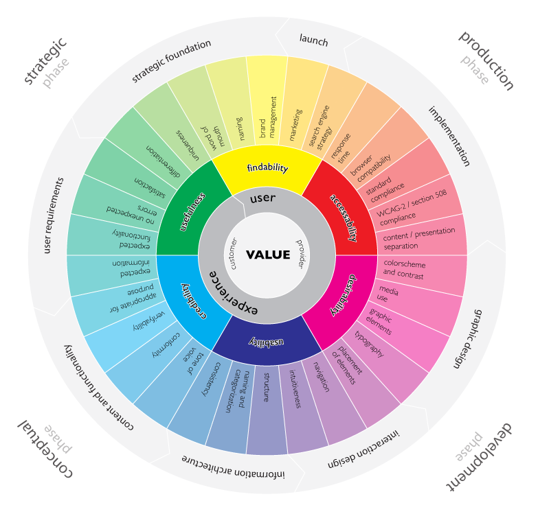
http://www.randsinrepose.com/assets/wheel-large.png
Wheel graphic explaining value of User Experience Design.

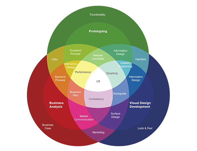
So many distinct subfields fit into this moniker Experience Architecture: information design, project management, document management, usability, user-centered design, document design, information architecture, findability, taxonomy: this isn’t a laundry list, at least not to me. These are places on a map, a map called UxD by practitioners and a map I’m learning to call Experience Architecture. 

Every class is an experience waiting both the be experienced and designed. While the OWL Usability Project is a discrete experience, being designed to improve the Online Writing Lab’s online materials more accessible and more user-centered, the class in UxD is also designed to allow students majoring on professional writing to see themselves as future UX professionals. Or, if they do not want to go the route of digital design, to help them articulate their own focus within professional writing.

A map of UX presented at UXThought.com

I like to joke with the new majors that if I told them what career they would have at graduation I would be lying to them. Some don’t get it, while others look horrified. But I stand by my assessment: a recent graduate, who is now working for a major museum as their Social Media Coordinator, did what we later came to understand was an internship in social media. But in 2009, it was not clear what the field would be called nor what job titles would be instrumental in advancing the state of the art. Social Media Coordinator is now a thing, and it’s a title that programs and individuals are chasing. But you know what? The opportunities are now diminishing and there are more opportunities in other related as-yet unnamed pursuits.

It is that continuous and rewarding pursuit of the emergent, the new--what my colleague Patricia Sullivan have recently be calling the constant of change. That is what I am after. So it really does not matter if, in my class officially titled “Advanced Professional Writing,” we say we are studying UxD or Experience Architecture, or Social Media. What we are pursuing is the ever-emergent new, and articulating what’s next before it is yet articulated.

Fred Cavazza's 2014 Social Media Map is an iterative design he updates annually.

So we follow and lead: follow where people have made headway. Interestingly, we lead when we feel most lost. And this is what I have to constantly remind students, even those advanced expert graduate students, that when they feel most lost that they are making the best progress. When you are coining new knowledge, you have to feel like you are making it up. Because we are. emergent knowledge, the new, has to be disconcerting, uncanny, and uncertain precisely because its like has never been seen on the planet before, not in this guide, not in this context. And while many are quick to point out that nothing is new, and it’s all remix, all I’ll say is that, in a manner of speaking that is correct. Yet each new contextualization, re-contextualization, reappropriation, and rearticulation is something new that has not yet been experienced quite like this before.

This semester, I am teaching advanced professional writing, the capstone professional writing major class, as Rhetoric & Experience Architecture. Previously, I've taught it as UxD, Information Architecture, and Information Design. Each of these previous versions felt a little constrained, a little tight. The expansive nature of Rhetoric & Experience Architecture allows the class some breathing room: the technologically inclined students are running ahead of the pack with an Eye Tracking Unit from Grinbath as well as a number of techno-gizmos, only to be added for user-centered functionality, of course. But there is a design team, a team dedicated to compiling an OWL style guide (which has been needed for years), as well as a real innovation I have been very happy to support. One mature student has taken on the role of project manager. Every class meeting, this student does the opening introduction to class, recapping what has been accomplished, upcoming deadlines, and what we said we would be doing in class for the day. At the end of class, the project manager recaps the day's accomplishments and forecasts deadlines and content for the next class. It hasn't displaced me as the classroom teacher but it has required me to renegotiate my pedagogy. In class the other day, the project manager led discussion while I took notes. I realized that not only hadn't I spoken for ten minutes, but that no students had turned around to look at me taking notes at the back of the class. That was a new and exciting development.

The class is, by definition, a site of instructional design. It is also a designed user experiencean enactment of all the core competencies at the heart of Technical and Professional Communication (TPC), and a safe space for inexperienced TPCs to try on a number of professional specialties at the start of their final year of study before joining practitioners in the field.

The goal for my class is to help students figure out how to maintain attention to and dedication for their role as user advocates. My goal for the OWL Usability Project is to continue to act as user advocate for the many worldwide millions of users of this wildly successful website that supports so many in their attempt to improve their written English skills. We aim to collect user data only to improve the site — building better experiences through understanding who is accessing existing resources, and through what technologies. We are seeking large numbers of responses to simple questions to see if the users we test more qualitatively represent our wide user base. We are also setting out to collect more metrics to accomplish similar goals. We aren’t interested in finding anything out about individual uses but rather in understanding the statistical probabilities of user patterns, to develop metrics so that we can better anticipate user needs. I invite you to volunteer if you have 5 minutes, 20 minutes, or 90 minutes to give to the OWL. Over the years, many of you have expressed interest in finding ways to give back to OWL, and this is your chance: we need your time, and we need anonymized data that only you can provide.

We know what text books look like from too many years of developing the genre, and we know what patterns of classroom instruction look like. And now, after 20 years, we know at the least what one OWL can look like. But what we don’t yet know is what the next 20 years of OWL might look like, we do not yet know what else is possible with the medium. It is possible that we have reached a dead end. It is also possible that over the next year or so of user inquiry and usability exploration that we might just get lost enough to realize that, in hindsight, we have invented whole new modes of engaging with the OWL’s users, new modes of providing content, and created whole new designs for interaction. That is, we may have just begun architecting the OWL users’ experience.

I hope you’ll join me and these energetic students in the project of inventing new possibilities for designing and sustaining the Online Writing Lab at Purdue.

An image containing data about UxD jobs in the US taken from 2013 data.
Taken from the UX Career Guide at Onward Search
http://www.onwardsearch.com/career-center/ux-careers-guide/

Thursday, September 4, 2014

On-Campus Reconnaissance

I recently participated in user testing for one of the departments on campus revamping its heavily-used website.  I won’t identify the department to protect its study and work, but I will say that the site is an important resource and instructional tool on campus.  I’m a frequent user of the site, and as someone involved in the next usability study for the Purdue OWL, I wanted to provide what I hoped would be helpful feedback and learn about the usability work happening elsewhere on campus. 

I like participating as a user and giving feedback.  My first introduction to usability was as an early adopter and usability participant for the TOPIC project at Texas Tech University.  Since then, I’ve become an advocate, a learner who knows a few things though not an expert.  I’m generally the type who will respond to improvement and marketing surveys or provide user reviews, but usability is something else and something more.  When I have a chance to do more than respond to a site’s color scheme or some low-level feature, I will take the opportunity because it’s a learning experience for me. 

So I agreed to give an hour of my time to meet with the researcher and provide information about the department’s existing site and upcoming changes.  I was given a short demographic survey and then asked to perform a series of tasks on the site, mostly related to locating specific pieces of information or resources on the site.  I relied heavily on the search tool (which makes sense given this particular site), and I was introduced to features I didn’t know about.  The researcher made an audio recording of my responses and also recorded my movements on the screen.  The tasks were most interesting, and it became clear to me that the study was aimed at the site’s search functionality and menu structure. 

I tried to be as clear and detailed as possible in my responses because I know how difficult and yet valuable it is to know what users find helpful or not, what features they want and need, and what parts of the site have simply been overlooked.  It’s a vulnerable moment for site administrators, webmasters, designers and other staff when presented with users’ feedback.  Data can offer surprising results, including the fact that a feature lovingly created and nurtured by a designer is not helpful to—or worse, vehemently hated by—users.  Feedback can result in the need for significant revisions.  These are some reasons why usability research is given just a passing, suspicious glance by designers. 

Yet usability is extremely important, and because I valued the campus website I was asked to test, I wanted my feedback to lead to beneficial changes.  Nevertheless, I was very much aware that I had two purposes for participating in this study:  as a legitimate user and as someone doing reconnaissance for her own usability project. 

One of the most important things I learned from this experience is that test subjects can find usability studies as difficult as researchers do.  It’s not always possible to articulate a reason for a preference or a process, so researchers need to be clear and offer alternative explanations without leading the research subject toward a certain (preferred) response. Also, recording subjects’ responses can be helpful, since researchers cannot take detailed notes while paying close attention to what users are doing and saying, what their eyes focus on, or what the mouse clicks.  And tracking users’ clicks and mouse movements with with software can reveal information that may not be easily detectable by researchers.

And finally, usability is time-consuming work, even with technologies that can make tracking, recording, card sorting, and other activities easier.  The researcher spent nearly an hour with me just administering the tests.  He and his co-researchers will then have to compile data gathered from me and other participants.  They will have to wade through all that information to see what it yields about site users’ and their preferences and needs.  They will have to give that information to site designers and programmers.  Someone, somewhere will have to decide what revisions should be made to the site.  And then someone else has to make those changes. 


The amount of work, time, and resources involved is not surprising, especially after the previous OWL usability study.  Like the campus website I tested, the OWL is a heavily trafficked and complicated resource with many different stakeholders to consider.  I know from experience that we’re in for several semesters’ worth of work, and with that in mind, I eagerly but patiently await any changes to the site I tested, knowing that results can take time.  And I look forward to figuring out what this next OWL usability project will be like.