Wednesday, October 22, 2014

Purdue OWL Usability – September/October Update

A lot of work has happened in recent weeks connected with the usability study. In early September Tammy, Michael, Cait, and I sat down for a meeting to discuss potential areas for the students in Michael’s Advanced Professional Writing course. There were a number of concerns that were brought to the table: concerns relating to navigation, the splash page, connecting users to resources, presenting resources to users, and the functionality of our contact forms. What was beneficial was having two members of the research team from the last round of usability studies present, as they could speak to what we’ve done before, what we chose to address at that time, and what might be worth reexamining. Having the technical coordinator present also opened up new areas for discussion, as she deals most often with the OWL’s innards—the code that keeps it soaring, ready to swoop in and assist users in need. One issue that was brought up was how users experience the OWL. Currently, we have what some have derided as a 1990’s-esque splash page, and certainly its actual usefulness is something that ought to be questioned. But, during the course of our discussions that day it was pointed out that perhaps the splash is even less effective than we had hoped. One of the meeting members pointed out that we need data on how people actually use the OWL, perhaps many people bypass the splash page all together. Here’s an anecdote for illustrative purposes: 
I use the OWL a lot for my own personal reference as I write for publication and the job market, activities not even remotely related to my position as the OWL coordinator. Now, when I’m looking for information on Academic Cover Letters—for those increasingly rare tenure-track jobs—I don’t go to owl.english.purdue.edu. Rather, I go to Google and I type in, “ ‘Purdue OWL’ + ‘Academic Cover Letters’”. The very first hit is the opening page for the Academic Cover Letters resource on the OWL. Then I start to click, click, click away. To be honest, there are some days that I completely forget that the splash page exists. The argument for it being there is that the OWL isn’t just the collection of writing resources; it’s not just the Orange OWL. It’s the Purdue OWL Family of Sites; it’s the Orange OWL, it’s the Purdue Writing Lab site (green pages), it’s the Purdue OWL News Service (purple pages). 
We also discussed the intersections of content development and usability. The Purdue OWL, over the years, has developed its own written identity. This is something that has been passed down orally from one content coordinator to another during training and on-boarding sessions. It is then something that is highly negotiated during between content coordinator and their developers during the content development process. The discussion with the students in Michael’s course became, what can we do to crystalize certain elements of our style into a Purdue OWL Style guide, a document that will help to streamline certain elements of the development process and that will also concretize institutional memory and best practices? At a meeting of members of the usability teams and Purdue OWL leadership, I was given a list of areas in which the student-team working on the Purdue OWL style guide would like to focus their work. I must admit that I’m both impressed by the thought that is going into this document and hopeful for the lasting contribution that it can make to the Purdue OWL—and perhaps to OWL designers and content developers working in other contexts. The student-team plans on not only solidifying the most salient points of OWL style, but also on redesigning the current OWL content developers manual to be more effective in transmitting information to the content development team members. During the course of the various meetings and conversations that have been had at the OWL about usability in the past two months, another key item has arisen. Designing and implementing usability studies can take time. We’re making plans that will carry use well into the 2015-2016 academic year. 

However, when you’re working with graduate staff this can present new challenges. Both myself and Cait are likely to complete our Ph.Ds. before the start of the next school year. This means that two individuals that have played some role in this round of testing will be exiting Purdue before it’s over. This means that we must consider how we will hand this project off to the incoming content and technical coordinators. This is a key consideration when working in any context that has this kind of turnover. Ensuring continuity becomes important in order to maintain quality and to provide the best service to our end-users. For us, we will rely heavily on the experiences of both Tammy and Michael—this is their second round of usability studies on the OWL, and we will also allot additional time to bring the new coordinators up to speed regarding the usability study, how it impacts their work at the OWL, and how they might contribute to this intensive practical and scholarly endeavor.. This will likely include a healthy stack of documents and intermediate reports, but it will help us to ensure that the new coordinators will be adequately prepared not only to join the OWL family, but also to continue to contribute to our usability studies and eventual revisions.

Tuesday, October 21, 2014

Going Down by Jessica Schwingendorf

Yesterday I had to think.

I was in Young Hall for a job interview which was held on the 2nd floor. I used the elevator to get to the room with no problem. I stepped in, pressed the "2" button and exited per usual.

Elevators are pretty self-explanatory. It shouldn't take much thought to operate one, and I've had hardly any issues with them in the past.

However, upon exiting the 2nd floor post-interview, I was forced to think.

I walked in the elevator alone and went to reach for the button. I wanted to return to the main ground floor, which is often labelled as different things, depending on the building. Sometimes it's a "1". Other times it's an "L" for lobby, "G" for ground or "M" for main floor, and so on.

Whatever the label may be though, it's standard for the ground or first floor button to be accompanied by a star for clarity.

When I went to reach for the "G", "L", "M" or "1" I automatically just looked for the star since I don't often go into Young Hall and was unfamiliar with how its ground floor is labelled in the elevators.

But there was no star!

A wave of panic went through my body and stood there dumbfounded for about 2-3 seconds, which doesn't seem long, but in my state I had no idea how to get where I was going.

Did I want the basement? Where is the "1" button? What does "M" stand for? Mezzanine? Main?

I actually had to read the buttons and think about what floor I was going to and how it was

labelled. It wasn't the automatic process of reaching for the starred button like I usually experience.

I found this experience to be an excellent example of how we as humans are conditioned to follow a routine or standard, and when that routine is interrupted due to poor or variant designs, we panic and have to think.

This elevator, in general, follows logical signifiers that aided in my determination of the ground floor (after a few moments of thinking, of course). During my time abroad last semester I had to get used to the idea of the ground floor not being the "first" floor. In France, the ground floor was simply that, the "ground" floor. The floor above the ground was then the "first floor". I lived on the 8th floor of a
a French apartment building, but by North American story standards, I lived on the 7th floor.

Knowing this standard information, and the fact that I was in a North American building, I then had two choices: "B" or "M". This conclusion was reached because the floor numbers are laid logically starting with the bottom floors as the bottom buttons and the top floors as the top buttons. However, the "B" and "M" were on the same line of buttons.

So I continued to think.

Even if I did not know the definition of the "B" and "M’ floors, I could conclude that the "M" was the main entry floor above the basement because the lower floors on each line are located to the left. Thus, "B" was the lowest floor and I needed to press the "M" button.

After some research into the topic, I discovered that the five-pointed star I so longed for stems from the 2010 ADA Standard for Accessible Design. The star indicates the floor with the quickest available exit in case of emergency. This is namely the ground floor, where the main entry and exit way is located. This is the same standard that requires brail numbering on the buttons.

I am not familiar with the history of this specific building on campus, or why it does not follow this standard, but it nonetheless illustrates how standards and logical signifiers play such a large role in our daily activities.

It is important, therefore, to keep designs streamlined and consistent so that users don't need to figure things out for themselves. It is up to the designers to adhere to modern standards and follow the guidelines laws and logic law out for them. When designers deviate from the standards, people are lost and in other cases may not find a solution as quickly as I was able to do.

The signifiers, and therefore the instructions, should always be obvious. Users shouldn’t have to think referring to principles seen in Steve Krug's Don’t make me think, revisited: A common sense approach to web and mobile usability.

References

Krug, Steve. (2014).  Don’t make me think, revisited: A common sense approach to web and mobile usability.  San Francisco, CA: New Riders


Friday, October 17, 2014

Waging War on a Machine by Kaitlyn Neis

I got in an epic fight with my washing machine this week.

It seems a simple enough process, right? The user adds two things to the machine (soap and clothes), pushes a couple of buttons, and ends up with clean clothes. 

Not in this case.

There is no standard set for washing machines, meaning that manufacturers are able to take whatever liberties they like with them. Somehow these liberties never seem to extend to leopard print paint jobs or buttons with weird shapes. No, it's always the controls. Even though people will often say they find one setting they like and use it over and over again (see The Design of Everyday Things), manufacturers like to make it complicated.

I like having the option to wash my clothes in the appropriate temperature, or to do a gentle wash if I have nice clothes, but generally I don't need 60+ combinations I can use. Last time I did laundry, I discovered that the dial must be pulled instead of pushed to activate the chosen cycle. Not only is the pulling action not intuitive, but the button doesn’t recede inward once the previous cycle has ended. This results in the user pushing the dial and expecting it to start, user frustration as they attempt to reset the machine, and only then success as they try pushing the button in again out of frustration.

My issue this week arose when I set the machine to ‘extra spin’ which I understood to mean that the cycle would include an extra spin cycle after washing. Jeans don’t dry well if not spun extra, and I had several pairs of jeans. I added soap, closed the lid, and started the cycle. Simple, right? I heard the machine start and figured it was fine to walk away.

When I returned, I found that my clothes were entirely dry. No, the machine didn’t spin well enough to do that, the clothes were never washed in the first place.

Cue frustration. 

Of course, I assumed that I was wrong, that I had failed to turn the machine on at all. I was in the middle of homework, and it’s not unheard of for me to do absentminded things when I’m focusing on something else. I grumbled, reset the machine, and started it. This time, I stayed around and listened to it start.

I returned later to find that…my clothes were still dry.

What?

Whatever this was, I knew I had heard the washer start. Why hadn’t it washed?

Long story short, I eventually discovered that I had set the machine to spin…without washing the clothes first. In the end, I used the setting I'd previously discovered worked.

Why was the machine designed to allow users to do that at all? Perhaps if you felt that your clothes hadn’t been spun enough in the first place, you might add an extra cycle, but otherwise it only serves to confuse the users of an already counter-intuitive machine.

My experience brought a number of ideas to light in response to the work we've been doing on navigation. I knew how to do one cycle on the washing machine, and I was essentially punished for attempting to use a different pathway. Interestingly, this is one issue that could be faced with the OWL. The changing of known pathways and users' understanding of the website will have a serious impact on our initial decisions as we look at the current OWL design and determine what most needs to be changed.

On the current website, people may know one way of getting the result they want, but when they attempt to get the result in a different way they are unable to access the materials they need. Design should not only be intuitive, it should also allow the user to access what they need through multiple easily-discoverable means. With the redesign in mind, we need to take both returning and new users into account. 

For the OWL, this could mean on the webpage, such as being able to access things through the search bar as well as by using the typically prescribed path. It could also mean accessibility through different devices, ones that are fairly outdated or the most recent smartphone. There are a number of considerations when redesigning a webpage for usability, and I think that our class is finally reaching the point of digging into the meat of the matter.

The Design of Everyday Office Chairs by Mary McCall

In the first chapter of Don Norman’s The Design of Everyday Things, Norman discusses his problem with doors. He admits that so simple a technology should not be seen as so confusing. Or so we think. I’m sure when most of us (and by “us” I mean Americans) think of a door, we summon the image of rectangular piece of wood with a knob on it. And yes, there are many doors like that, but there are also doors made of glass, metal, or other materials, doors that push forward or are meant to be pulled back, doors that slide, doors that don’t open by human hands, or doors that are not meant to be opened at all or any at certain times.   

When we approach a door, we often look for some kind of signifier (what Norman describes as something which signals which actions are possible and how they should be done) that shows us what the door's affordance (an interaction between people and their environment) is. Often times, we know that we can push or pull a door and so look for something to signal the kind of interaction that we should be having with the door. Sometimes this signifier is a knob or handle or even a flat panel that indicates that the door should be pushed. However, when those signifiers are absent or unclear, this “simple” piece of technology suddenly becomes complicated

This, finally, brings me to office chairs.

Office chairs make me weary because every time I see one, I am reminded of previous battles I’ve had with its kind and lost. When I walk into a computer lab with office chairs, I feel them silently judging me.

Why? Let’s start with this specimen here (Fig. 1.).

Fig. 1. Innocent-looking office chair

At first glance, it looks pretty innocent. It looks somewhat comfortable, despite having supported the posteriors of how many grad students before me. And, at second glance, it seems easy enough to adjust the seat to my desired height (Fig. 2).

I see the lever on the right-hand side and think, “Ah, OK. If I pull the lever up or push it down, I’ll likely move the seat in some kind of direction and eventually get it to the height I need.”

Hah. Wrong.

I sit in the seat, grab the lever, and pull. Nothing. I push it. Nothing. I start jiggling the lever harder, because surely that will do something. Nothing. I move the lever to the left and right just for kicks. The seat refuses the budge.

“OK,” I think. “Maybe there’s some kind of lock on it. Maybe there’s a knob on the left I have to turn to release the lever.”

So I get up, squat down, and look under the seat. Nope. No knob. Just the lever.

Fig. 2 "I won't make you cry in frustration!"
“Maybe it’s broken. Maybe it just gave up on life and this height is all it has to give.” 

I roll the chair away—it stares at me with dejection—and grab one of its buddies nearby. I repeat the same operations. Still nothing.

Then, not far away, I see Option #2. This one is certainly the grandfather of the first seat. It looks more worn--if that’s possible with these chairs--the post is rusty, and its base is dusty and dirty. But hey, it looks solid enough and could be easier to handle than these younger whipper-snappers (Fig. 3).

Fig.3 
When I sit in it, my hand shoots down the right-hand side, but there’s no lever. Leaning over to the left proves no lever either. Against my better judgment, I reach my hand under the seat. There’s only a knob there (Fig. 4). Should I turn it? Does this knob secure the seat to its base or does it adjust the height? I twist it in either direction, but nothing happens.  

“Fine,” I mutter, grabbing the first chair I tried. I’m used to talking to myself and inanimate objects.  “I’ll deal with the height. I wanted this chair so low that I could type with my nose anyway.”
Fig. 4 "I swear I'm not covered in gum."

Looking back, maybe the green chair wasn’t meant to be adjusted (but then why does it look like a chair that could be?) or maybe I just never figured out the right mechanism to achieve the solution I wanted. With the purple chair, the lever did act as a signifier suggesting the affordance I could have with the chair, but it ended up being a confusing one since it did not act in the way I imagined it would.
Fig. 6

Fig.5 Is there hope?
However, not all office chairs are evil spawn (Fig. 5). While this one has *two* levers (oh boy), each lever does have a clear signifier of how it’s meant to be operated and what result will ensue (hooray!) (Fig. 6). Overall, then, this chair is a good example of what Norman describes as the “two most important characteristics of good design”: discoverability and understanding (3). While discoverability suggests which actions are possible and how to perform them, understanding indicates how the product is meant to be used. With office chairs, the understanding is clear: you’re meant to sit in them. However, what separates an office chair from an “ordinary” one is that its mechanics can individualize even the seemingly simple action of sitting. But if the operation of these mechanics is unclear—as my failed attempts above suggest—then the second piece of good design, discoverability, will be missing. 

Thus, the vague signifier of a lever on an office chair is often not enough to suggest the affordances of the chair itself. Yes, office chairs have been around for quite some time and even as a lefty, I’m conditioned to expect the lever to be on the right-hand side of the chair. (Recall how my hand automatically shot down with Option #2 before I even realized there was no lever.) And interestingly enough, I’m also conditioned to pull the levers of most office chairs up even though I want the seat to go down. 

However, when pulling—in any direction—does not cause the seat to move, or there are so many levers that I have no clue as to which exact one to use, then my experience as a user of this product becomes fraught. This is where signifiers like the images on the levers of Option #3 come in handy and also reflect good design. Of course, these signifiers are not in themselves a guarantee that the mechanisms will work (given how much they’re in use everyday and how easily they can be jammed or broken), but even these signals go much farther in making what should be a simple technology (like an office chair) actually simple to use. Or so we hope.

Works Cited

Norman, Don. The Design of Everyday Things. New York: Basic Books, 2013. Print. 

Monday, October 6, 2014

Experience Architecture and OWL


Experience Architecture is the most generalizable expression of creating an environment: it includes analysis techniques like usability and user-centered design, as well as instructional design and information architecture, findability and taxonomy. It is, perhaps, the name for one of the Sciences of the Artificial that Herbert Simon wrote about in 1996. 

Until recently, I had been satisfied that Information Architecture would suffice to describe what I was talking about, but even though I had written about the process and products from a PTC (Professional and Technical Communication) perspective, database, information service, and information technology (IT) communities were still battling over its use, even if Rosenfeld and Moreville had pretty much won on the intellectual merits of the case. When the usability practitioner community changed its name to the User Experience Professionals Association, it became clear that merits be damned. There was change afoot.

Liza Potts, my colleague and friend, had been arguing for some time about the merits of using the title Experience Architecture for what we do. Her reasoning, which I have come to accept, is that as industry and practitioners flit about from term to term, from Usability to Information Architecture to User Experience Design to whatever may come next, that Experience Architecture is a reasonable term for this arena of the administrative arts and sciences of the artificial. Experience Architecture can be “ours" so long as the implied “we" is academe. 

http://www.randsinrepose.com/assets/wheel-large.png
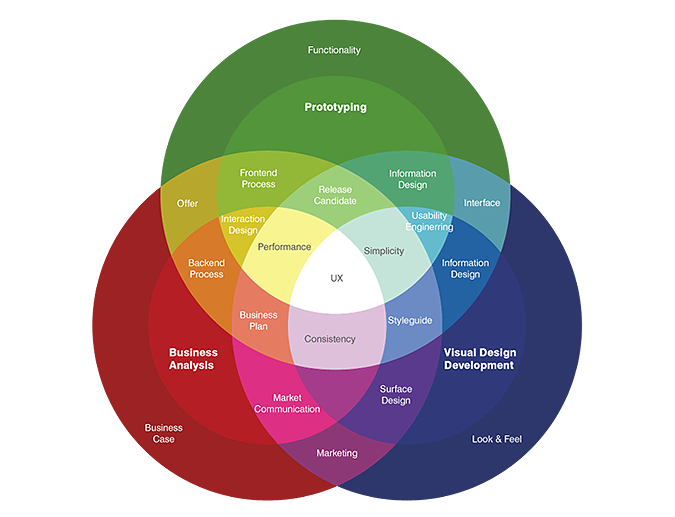
Wheel graphic explaining value of User Experience Design.

So many distinct subfields fit into this moniker Experience Architecture: information design, project management, document management, usability, user-centered design, document design, information architecture, findability, taxonomy: this isn’t a laundry list, at least not to me. These are places on a map, a map called UxD by practitioners and a map I’m learning to call Experience Architecture. 

Every class is an experience waiting both the be experienced and designed. While the OWL Usability Project is a discrete experience, being designed to improve the Online Writing Lab’s online materials more accessible and more user-centered, the class in UxD is also designed to allow students majoring on professional writing to see themselves as future UX professionals. Or, if they do not want to go the route of digital design, to help them articulate their own focus within professional writing.

A map of UX presented at UXThought.com

I like to joke with the new majors that if I told them what career they would have at graduation I would be lying to them. Some don’t get it, while others look horrified. But I stand by my assessment: a recent graduate, who is now working for a major museum as their Social Media Coordinator, did what we later came to understand was an internship in social media. But in 2009, it was not clear what the field would be called nor what job titles would be instrumental in advancing the state of the art. Social Media Coordinator is now a thing, and it’s a title that programs and individuals are chasing. But you know what? The opportunities are now diminishing and there are more opportunities in other related as-yet unnamed pursuits.

It is that continuous and rewarding pursuit of the emergent, the new--what my colleague Patricia Sullivan have recently be calling the constant of change. That is what I am after. So it really does not matter if, in my class officially titled “Advanced Professional Writing,” we say we are studying UxD or Experience Architecture, or Social Media. What we are pursuing is the ever-emergent new, and articulating what’s next before it is yet articulated.

Fred Cavazza's 2014 Social Media Map is an iterative design he updates annually.

So we follow and lead: follow where people have made headway. Interestingly, we lead when we feel most lost. And this is what I have to constantly remind students, even those advanced expert graduate students, that when they feel most lost that they are making the best progress. When you are coining new knowledge, you have to feel like you are making it up. Because we are. emergent knowledge, the new, has to be disconcerting, uncanny, and uncertain precisely because its like has never been seen on the planet before, not in this guide, not in this context. And while many are quick to point out that nothing is new, and it’s all remix, all I’ll say is that, in a manner of speaking that is correct. Yet each new contextualization, re-contextualization, reappropriation, and rearticulation is something new that has not yet been experienced quite like this before.

This semester, I am teaching advanced professional writing, the capstone professional writing major class, as Rhetoric & Experience Architecture. Previously, I've taught it as UxD, Information Architecture, and Information Design. Each of these previous versions felt a little constrained, a little tight. The expansive nature of Rhetoric & Experience Architecture allows the class some breathing room: the technologically inclined students are running ahead of the pack with an Eye Tracking Unit from Grinbath as well as a number of techno-gizmos, only to be added for user-centered functionality, of course. But there is a design team, a team dedicated to compiling an OWL style guide (which has been needed for years), as well as a real innovation I have been very happy to support. One mature student has taken on the role of project manager. Every class meeting, this student does the opening introduction to class, recapping what has been accomplished, upcoming deadlines, and what we said we would be doing in class for the day. At the end of class, the project manager recaps the day's accomplishments and forecasts deadlines and content for the next class. It hasn't displaced me as the classroom teacher but it has required me to renegotiate my pedagogy. In class the other day, the project manager led discussion while I took notes. I realized that not only hadn't I spoken for ten minutes, but that no students had turned around to look at me taking notes at the back of the class. That was a new and exciting development.

The class is, by definition, a site of instructional design. It is also a designed user experiencean enactment of all the core competencies at the heart of Technical and Professional Communication (TPC), and a safe space for inexperienced TPCs to try on a number of professional specialties at the start of their final year of study before joining practitioners in the field.

The goal for my class is to help students figure out how to maintain attention to and dedication for their role as user advocates. My goal for the OWL Usability Project is to continue to act as user advocate for the many worldwide millions of users of this wildly successful website that supports so many in their attempt to improve their written English skills. We aim to collect user data only to improve the site — building better experiences through understanding who is accessing existing resources, and through what technologies. We are seeking large numbers of responses to simple questions to see if the users we test more qualitatively represent our wide user base. We are also setting out to collect more metrics to accomplish similar goals. We aren’t interested in finding anything out about individual uses but rather in understanding the statistical probabilities of user patterns, to develop metrics so that we can better anticipate user needs. I invite you to volunteer if you have 5 minutes, 20 minutes, or 90 minutes to give to the OWL. Over the years, many of you have expressed interest in finding ways to give back to OWL, and this is your chance: we need your time, and we need anonymized data that only you can provide.

We know what text books look like from too many years of developing the genre, and we know what patterns of classroom instruction look like. And now, after 20 years, we know at the least what one OWL can look like. But what we don’t yet know is what the next 20 years of OWL might look like, we do not yet know what else is possible with the medium. It is possible that we have reached a dead end. It is also possible that over the next year or so of user inquiry and usability exploration that we might just get lost enough to realize that, in hindsight, we have invented whole new modes of engaging with the OWL’s users, new modes of providing content, and created whole new designs for interaction. That is, we may have just begun architecting the OWL users’ experience.

I hope you’ll join me and these energetic students in the project of inventing new possibilities for designing and sustaining the Online Writing Lab at Purdue.

An image containing data about UxD jobs in the US taken from 2013 data.
Taken from the UX Career Guide at Onward Search
http://www.onwardsearch.com/career-center/ux-careers-guide/